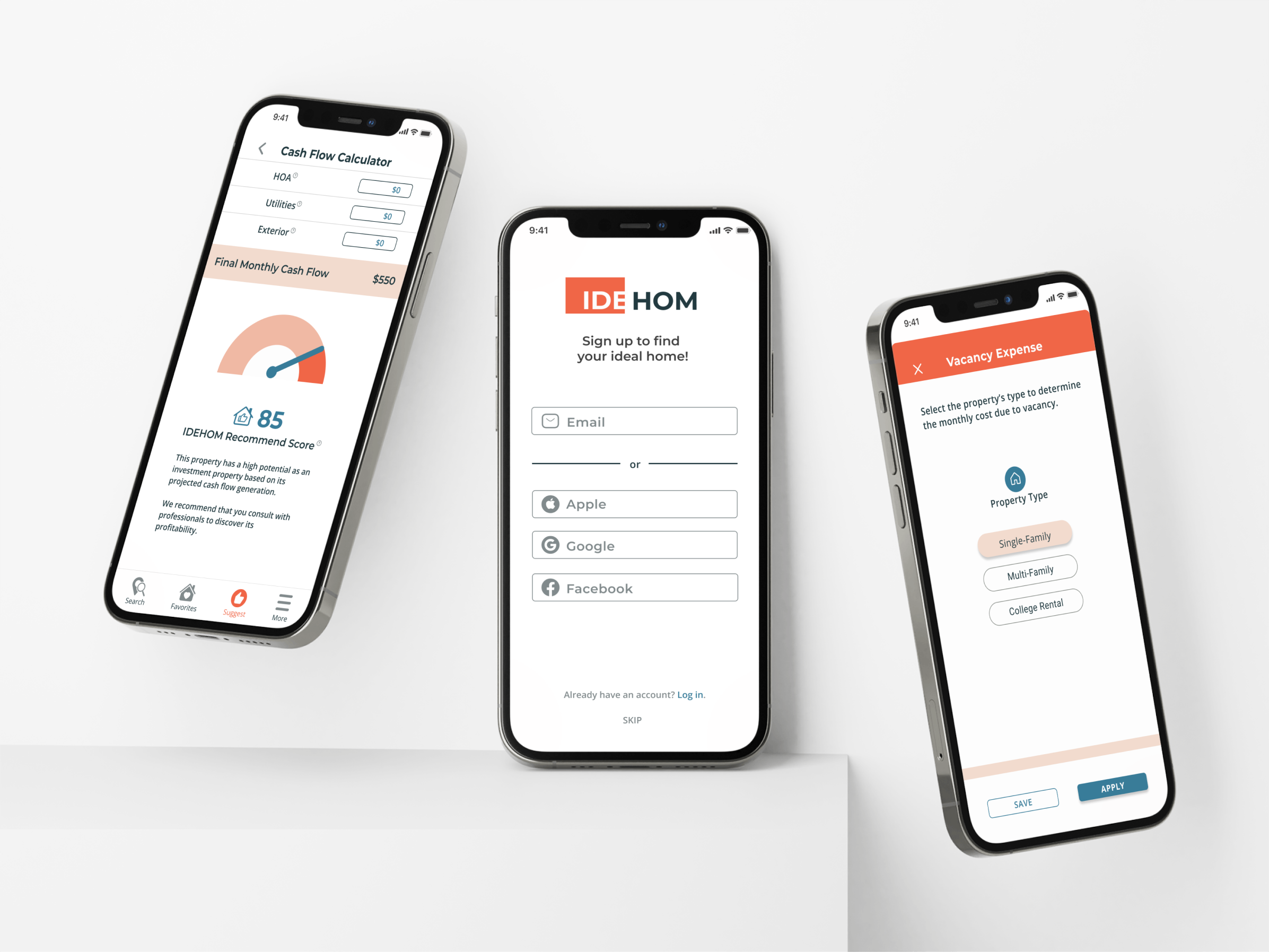
A solution to finding the IDEal HOMe.
IDEHOM is a responsive web app designed to locate and recommend ideal homes to buyers and investors. It simplifies the complex real estate transaction process so users can confidently invest in their financial futures. The handy IDEHOM Calculator prioritizes properties based on their viability or profitability and generate a recommendation score to help them make the right decisions.
The focus of this case study is on the UI of designing IDEHOM that follows the process of User-Centered Design.
PROJECT OVERVIEW
The Challenge:
Real estate investors needed a way to quickly search and identify the best buying and investment opportunities as a way to grow and secure their financial wealth.
The Solution:
Presented in a visually attractive and easy-to-understand interface, IDEHOM simplifies the search process by ranking profitable properties based on users’ criteria. The intuitive investment calculator helps investors make quick decision based on property cash flows and income generation.
The Outcome:
Potential app users expressed their desire for IDEHOM’s solution as it solved the frustration of finding profitable properties due to the lack of resources available for real estate investors. Success metrics will include new user sign-up rate, number of active users, and advertising revenue generation.
My Role:
Solo User Interface Designer using UX methodologies
Skills:
Competitive analysis, personas, user flows, wireframing, responsive breakpoints, moodboard, branding, style guide, usability testing, prototyping, presentation
Project Duration:
Jun - Sept 2022
Discovery.
Problem Statement:
The IDEHOM users need a way to quickly search and identify the best real estate buying and investment opportunities as a way to grow and secure their financial wealth.
Solution:
IDEHOM concisely filters homes based on specific user needs and narrows listing recommendations along with their financial potentials.
Additionally, users have the ability to update their preferences, review home information, favorite and share home listings, and most importantly, utilize the intuitive IDEHOM Calculator to easily discover profitable investments.
Competitive Analysis:
Like many popular real estate apps, IDEHOM allows users to search, filter, and save properties that are potential matches. However, IDEHOM differentiates itself from its competitors by addressing the financial opportunities that other apps miss.
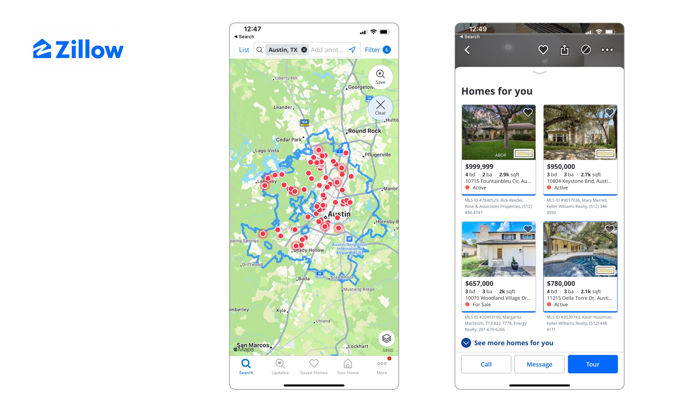
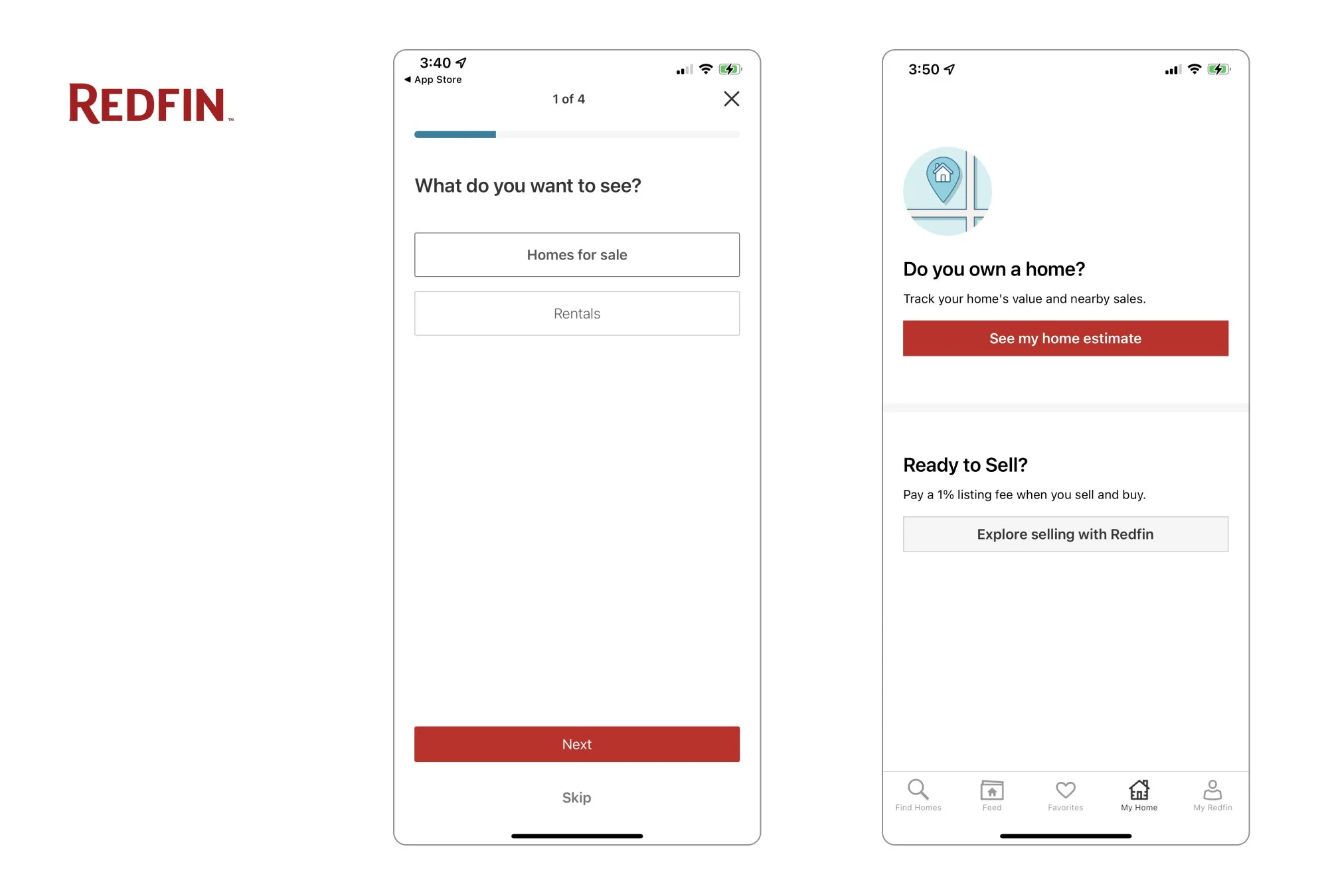
Here are the insights and selected screens from the competitive analysis of IDEHOM’s primary competitors Zillow, Trulia, and RedFin.
What did these competitors miss?
Too much too soon: Overwhelm users with too many search results at the start.
Too cluttered: Present cluttered and staggering amount of property listing information
No tools for investors: Provide tools for buyers, sellers, and renters, but not for investors.
Lack of empathy: Suggest irrelevant properties without fully understanding users needs
Not user-focused: Focus on selling to users rather than helping them make the right financial decisions
Personas:
In addition to the persona given to me in the design brief, I took the project one step further by conducting user research and identified a second persona that would benefit from the solution.
Specific user frustrations came into light during the interviews. These personas served as references throughout the design process by keeping their needs and goals in mind. In addition, they helped me prioritize the most important functionalities of the app.
Concepting.
The Discovery stage prioritizes one of the most important challenges facing investors today:
Identifying and prioritizing rental properties based on their potential to generate positive investment returns.
To address their frustration, I came up with two user flows to solve their problem as they navigate through the app.
Onboarding User Flow:
Before IDEHOM provides its recommendations, it needs to know the personalized user criteria. Therefore as highlighted below, the 5-step onboarding user flow promptly identify the best property matches based on the user’s needs and present them as search results.
Recommendation User Flow:
Once the user arrives at the search / results screen, they can favorite interested properties and review IDEHOM suggested listings. But the investment calculator that nested conveniently within each property listing is the critical financial tool for users.
The calculator pulls property data from each listing and prioritizes investment properties by profitability. This efficiently narrows the user’s search process and establishes IDEHOM as the industry leader to guide real estate investors to future financial wealth.
Low-Fidelity Wireframes:
Equipped with data from the Discovery stage, I sketched out wireframes for the onboarding and essential features that I hypothesized would solve the users’ problems and help them achieve their goals the moment they open the app.
Mid-Fidelity Wireframes:
After a simple paper and pen concepting, I used Figma to design the mid-fidelity wireframes with texts, basic UI elements, and icons to get constructive feedback from mentors and potential users. This process established opportunities for improvement for the prototype.
Responsive Breakpoints:
In consideration of bringing IDEHOM’s maximum potential to its users, I created breakpoints for tablet and desktop so they can quickly make important decisions where it is most convenient for them.
Designing.
The visual and interactive details of IDEHOM not only provide a delightful user experience, but they ultimately guide the users to achieve their task goals. The UI elements that I designed include logos for different use cases along with the style guide to keep the interface consistent for the brand. Accessibility is also taken into consideration so as to allow users to easily consume and understand the contents on the screens.
Mood Board:
The first step was to create a mood board, which sets a cohesive, visually attractive expression that makes the app’s vision clear. IDEHOM communicates resolution, clarity, and security to the users so they can confidently find the right homes.
Branding:
After carefully aligning the app’s vision, branding, and solutions, the IDEHOM logo is born, which stands for IDEAL HOME. Three styles are available for different use cases.
Style Guide:
Next, I created a style guide that encompasses all the branding and UI elements so it consistently communicates the app’s vision, in addition to placing accessibility with a higher priority. Here are some highlights:
Prototyping.
After multiple iterations, the mobile app prototype was ready for usability testings.
During this phase, the primary focus was to test the prototype to uncover any usability issues, in addition to gather general feedback from potential target users.
Once the issues were corrected, I also designed the responsive layout for the screens.
Iterations:
The IDEHOM screens has gone through multiple rounds of iteration, thanks to the feedback received from mentors and potential users.
Usability Testing:
Although there are many task flows that require testings, I was particularly concerned about the solution, which the onboarding and investment calculator flows specifically solve. In addition, I wanted to understand what the users think of the overall visual interface of IDEHOM and if they can tell what the app could do.
I recruited 6 local users to conduct in-person moderated testings and asked them to perform the following tasks:
Task One: “You just downloaded the IDEHOM app. Go through the onboarding process and arrive at the property results screen.”
Task Two: “After looking through the available properties, you find a suggested listing that interests you. Now search for this listing and determine if this property is worth investing.”
Testing Results:
Overall, users gave many positive feedback regarding the overall design and look of IDEHOM. Here are some comments from the user interviews.
Prioritizing the Problems:
By evaluating the testing results using Jakob Nielsen’s severity rating, I discovered some usability problems and prioritized any ratings above a 3 (0 = lowest priority to 4 = highest priority) with solutions.
Task One: Onboarding Flow
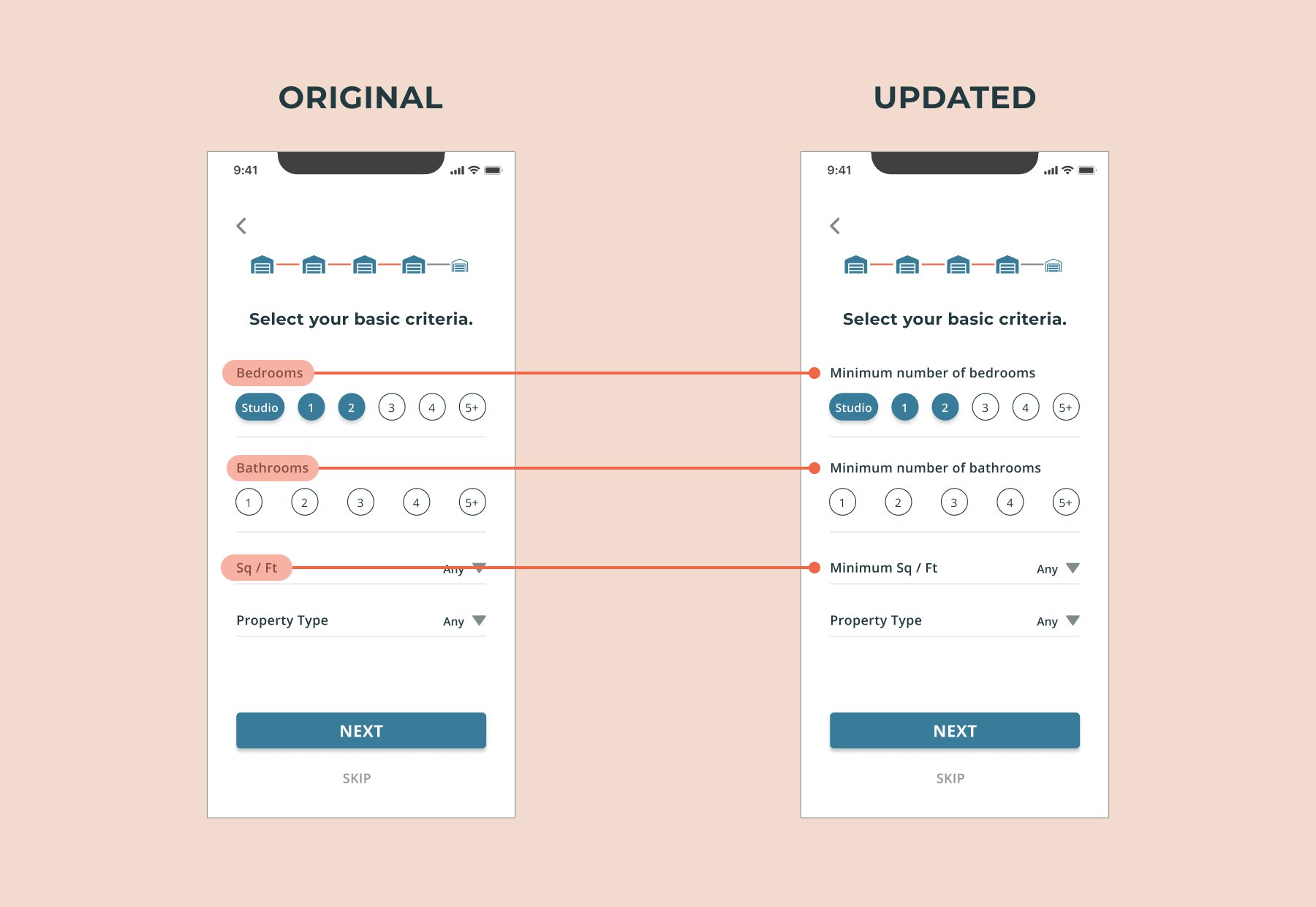
Error Rating 3 - “It looks like only a certain number of bedrooms or bathrooms can be selected.”
Problem - Some users were confused what the selected number of bedrooms or bathrooms meant.
Solution - Clarified by adding “minimum number of…”
Task One: Onboarding Flow
Error Rating 3 - “I am unsure if I can enter specific zip code or neighborhood here.”
Problem - 2 out of 6 users had trouble reading the light gray font inside the fill container. This was an accessibility issue that required immediate attention.
Solution - Added an instruction directly underneath the input container so they are now easier to see.
Task Two: Suggested Property Ranking
Error Rating 3 - “ I don’t know if the listings on top are better than the ones below or are they random? It will be very useful if they are clearly ranked.”
Problem - 4 out of 6 users wanted the recommended listings with rankings displayed.
Solution - Added number ranking icons on the top left corner of each property listing to indicate the order of importance.
Updated Prototype:
The usability testings provided invaluable insights to validate my solution for the real estate investor.
The first round of usability testings revealed no catastrophic issues; tweaks were made to resolve these findings.
Another round of testings with the same users suggested that the issues are rectified.
Check out how IDEHOM simplifies the search for the ideal investment home 👇
IDEHOM asks new users to go through a quick 5-step onboarding process (also optional to skip) to better understand their needs.
Locate a recommended listing on the result screen and let the IDEHOM investment calculator forecasts a property’s profitability potential.
Responsive Designs:
Because the IDEHOM personas like Danielle and Andrew are always on the go, it is important that they can find properties anywhere, any time.
The mockups show different breakpoints of mobile, tablet, and desktop for a responsive design to enhance the user experience.


Conclusion.
At the start of this case study, a quick competitive analysis of similar platforms suggests that there are resources available to locate properties. However, they have insufficient tools to help users, especially aspirational buyers and investors, to determine the right properties to invest in.
IDEHOM solves this problem by offering an intuitive financial calculator to analyze each property’s profitability in addition to the search, filter, and save features that they expect.
Key Learnings:
By clearly defining the problem, I was able to come up with a practical solution for the users in the beginning. Once again, it validates the importance of the Discovery process as I was able to efficiently target the right user flows and prioritize the features for the app.
On the other hand, I find it challenging to design the investment calculator.
Keeping my user personas in mind, I asked myself “Would Danielle and Andrew, who may not understand cash flow, be able to utilize the calculator with ease?” Nonetheless, I was able to organize a set of necessary financial data that is visually pleasing and functional by consulting with mentors and potential users.
Reflecting back on the usability testings, I could streamline the user testings by utilizing tools like Maze. This part of the design phase was laborious, and I could’ve efficiently collected the results if I used a similar tool for future projects.
Looking Ahead:
For IDEHOM to reach its highest potential, here at are the next steps that I plan to take:
Expand investment calculator beyond property listings
Design account setting (More)
Create buying and selling financial tools
Other case studies
TACKLE-IT
Yoginistones


